Film Poster: Research and Planning Tasks
Do some generic research on film posters.
3) What are regarded as some of the best film posters of all time? Why?
4) Look back at your statement of intent. What are you planning to produce in terms of your film posters? Can you take inspiration from your research above?
Film poster research - genre
Go back to the five film trailers you researched in your chosen genre (and additional films if you wish). For each film, find at least three different film posters for the film and analyse the following:
Get Out Poster
1) What conventions are the same on each poster for the same film (i.e. the film's consistent branding)?
3) What target audience do you think each poster is targeting and why? How can you tell?
4) What can you use from these posters in your own film poster planning and production?
Sinister


1) What conventions are the same on each poster for the same film (i.e. the film's consistent branding)?
3) What target audience do you think each poster is targeting and why? How can you tell?
The Conjuring
Planning and Sketching
1) Create a spider diagram or bullet point list of everything you plan to include in your film posters AND all the ways you could target the three target audience segments outlined in the brief: fans of the genre, males, females. Make sure you also create a local film festival in order to meet this aspect of the brief.
2) Produce an A4 sketch for your first film poster, adding significant detail in terms of text and planned images (you don't need to draw the image if you don't want to - but must offer a detailed text-based description if not). Clearly label which segment of the target audience you are aiming for with this poster and where the poster will be displayed (outside location, magazine or newspaper etc.) Remember that each poster can either be landscape or portrait and also needs to link to the local film festival that will be screening the film (see details in brief above). When you have sketched the poster, scan or photograph it and add it to your blogpost.
3) Produce an A4 sketch for your second film poster, clearly identifying the segment of the target audience this poster will be aiming at. Pay particular attention to details you will either keep consistent (to create a brand identity and cover the local film festival aspect) or change (to alter the target audience). When you have sketched the poster, scan or photograph it and add it to your blogpost.
1) Which of your characters will appear on each poster? If the characters will be the same on each poster, how will you differentiate the images?
My main protagonists as it is the group of friends in my film will be on two of my posters (targeting male and female). However the poster targeting fans of the genre will feature the abandoned house with dark low key lighting. For the third poster it will have both the protagonists and the the abandoned house.
2) What images do you need for each film poster? Write a detailed description.
My group poster will need an medium shot of the protagonists in a dark background in order to reinforce horror movie stereotypes. My female poster however will be a medium shot of the protagonist with a disturbed expression. Finally my fans of the genre poster will be a establishing shot of the whole abandoned building which will include
3) Write a shot list for the photoshoot(s). Make sure you plan a variety of camera shots you will look to capture (medium shots, close-ups etc.) to give yourself flexibility when designing the posters in Photoshop later. Will the photoshoot be out on location or in school with the white backdrop and lighting?
It will be just regular clothing that normal teenagers wear as its just the group of people together and its meant to be a modern time.The clothing itself may get dirty just to so it makes it look more realistic.
- Dark low key lighting
- Long shots of location
- Extreme close ups
- Minimal writing
- Use of props to convey horror
- Tag Lines
- Release date
- Age rating
- Film reviews
2) What makes a film poster instantly recognisable?
The title and the centre image is what captures the audiences attention. It is necessary to have a good strong centre image in order to have a successful film poster. The title/Name of the film is also what makes a film poster recognisable, this means that the correct font and positioning of the title is key in making a film poster.
3) What are regarded as some of the best film posters of all time? Why?
Vertigo is regarded as one of the best film posters as it is "simple, yet enormously effective image that works doubly well when translated to the film's opening titles. Jaw is regarded as the most iconic poster of all time. It is successful as it features a great centre image of a shark rising, "it is a viscerally terrifying image, one that struck fear into the hears of swimmers".
4) Look back at your statement of intent. What are you planning to produce in terms of your film posters? Can you take inspiration from your research above?
In my film poster that will target the thrill seekers in my audience, will contain a close up image of the protagonist's eye (possibly crying or widened). All my film posters will contain dark low key lighting and will have a simplistic font title to match the poster. Film reviews and quotes will be featured at the bottom of the poster significantly smaller then the title.
Film poster research - genre
Go back to the five film trailers you researched in your chosen genre (and additional films if you wish). For each film, find at least three different film posters for the film and analyse the following:
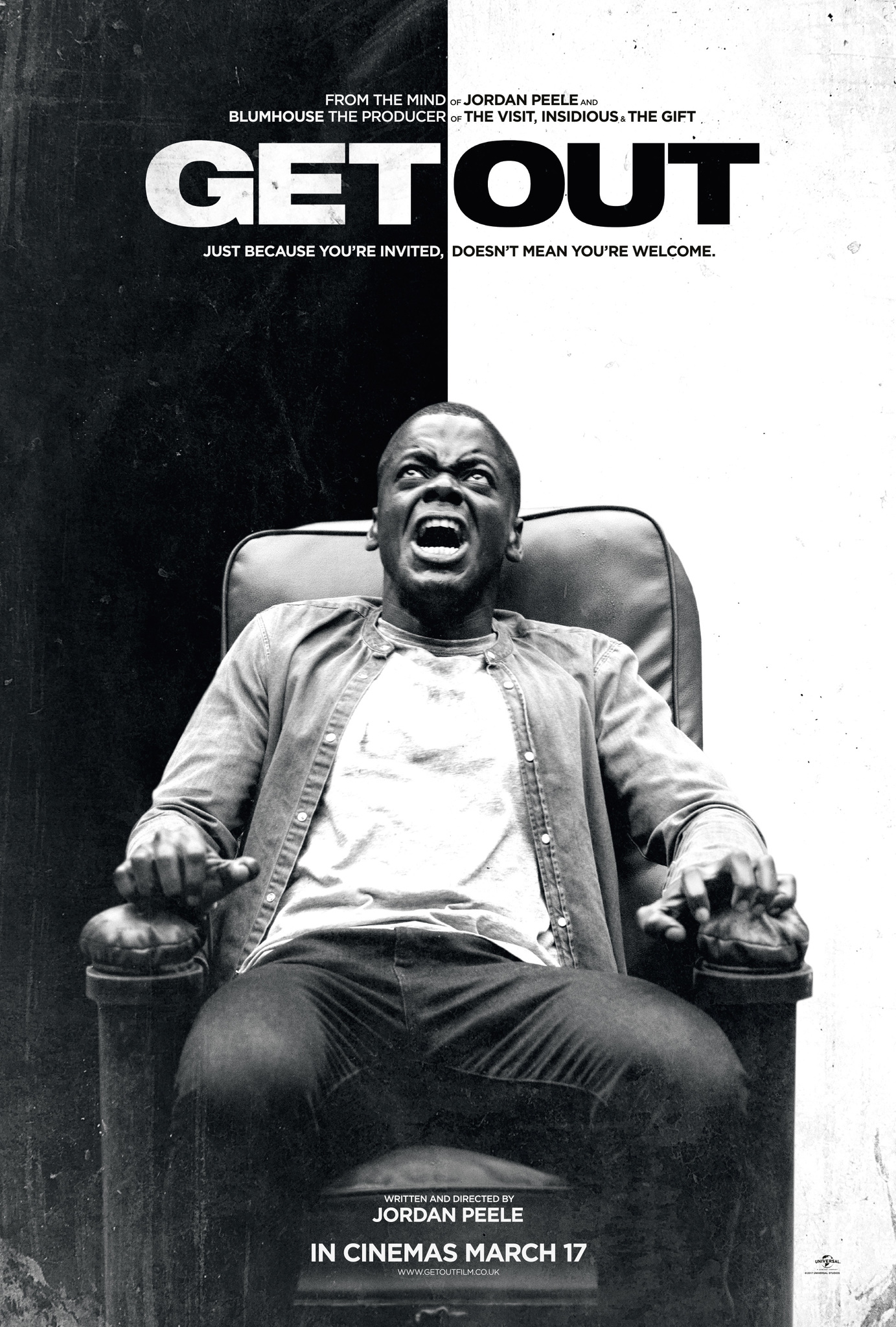
Get Out Poster
1) What conventions are the same on each poster for the same film (i.e. the film's consistent branding)?
- The protagonist is on each poster
- Dark low-key lighting used in each poster
- A black and white theme
- The protagonist crying or screaming in each poster
- Film critics and reviews at the top of the poster
- Release date at the bottom of the poster
- Black and white theme linked to the narrative of the film
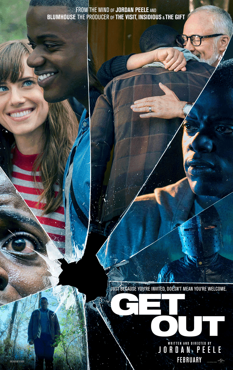
2) What differences can your find between the alternative posters for the same film?
- Some of the posters feature only the protagonists, other feature more (white) characters
- Quotes are not found on all posters
- Long shot used in the poster with the protagonist falling
- One poster features multiple different images all presenting something different (protagonist smiling next to an image of him distressed with blood shot eyes).
3) What target audience do you think each poster is targeting and why? How can you tell?
The poster featuring the protagonist sitting on the chair with a black and white background is likely to be targeting a male audience. The fact that this poster only features the male protagonist is likely to be targeting a male audience. Whereas the poster which features multiple images is likely to be targeting fans of the genre or 'thrill seekers' as it contains multiple different images which quickly shows a summary of the narrative of the film. This is successful done by pairing pictures of the protagonist looking terrified to pictures where he is smiling.
4) What can you use from these posters in your own film poster planning and production?
The central image of the protagonist in the poster is extremely powerful in communicating to the audience. The facial expression of the protagonist is a key part to this poster and I will likely use a similar approach to my poster. The positioning of the protagonist is simple and relaxed however the his facial expression contrasts this. it would be harder to do it for mine as i have a group of people.
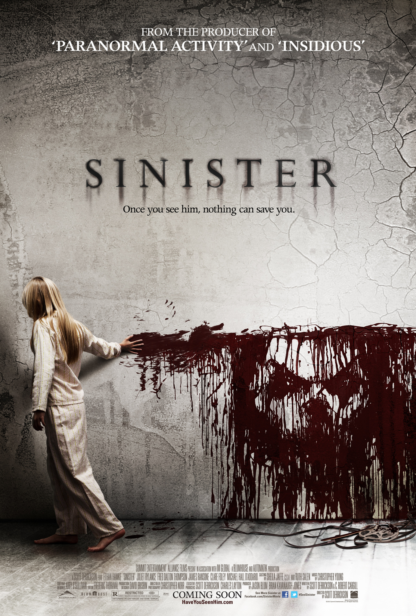
Sinister
1) What conventions are the same on each poster for the same film (i.e. the film's consistent branding)?
- The same center image is used in all posters
- The same font in all posters
- Director information at the top
2) What differences can your find between the alternative posters for the same film?
- The second poster includes another image of the protagonist
- The release date is only on one poster
- The credits isn't on the second poster
3) What target audience do you think each poster is targeting and why? How can you tell?
The second poster would target a male audience due to the fact that it includes the may protagonist however overall i don't think either of them are targeting a gender specific audience rather then fans of the genre.
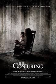
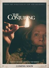
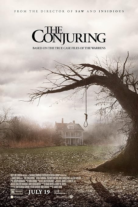
The Conjuring
1) What conventions are the same on each poster for the same film (i.e. the film's consistent branding)?
- Same font on the title on the posters
- Dark, low key lighting used in both
- Same director quote at the top of the posters
2) What differences can your find between the alternative posters for the same film?
- The first poster is taken of the villain whilst the second is of the protagonist
- No credit block on the second poster
- A scared expression is seen on the second poster
3) What target audience do you think each poster is targeting and why? How can you tell?
The first poster is targeted at fans of the genre as it features the villain of the film. The second poster however could be targeting a female audience due to the fact that it has the female main protagonist as the center image.
Planning and Sketching
1) Create a spider diagram or bullet point list of everything you plan to include in your film posters AND all the ways you could target the three target audience segments outlined in the brief: fans of the genre, males, females. Make sure you also create a local film festival in order to meet this aspect of the brief.
2) Produce an A4 sketch for your first film poster, adding significant detail in terms of text and planned images (you don't need to draw the image if you don't want to - but must offer a detailed text-based description if not). Clearly label which segment of the target audience you are aiming for with this poster and where the poster will be displayed (outside location, magazine or newspaper etc.) Remember that each poster can either be landscape or portrait and also needs to link to the local film festival that will be screening the film (see details in brief above). When you have sketched the poster, scan or photograph it and add it to your blogpost.
3) Produce an A4 sketch for your second film poster, clearly identifying the segment of the target audience this poster will be aiming at. Pay particular attention to details you will either keep consistent (to create a brand identity and cover the local film festival aspect) or change (to alter the target audience). When you have sketched the poster, scan or photograph it and add it to your blogpost.
1) Which of your characters will appear on each poster? If the characters will be the same on each poster, how will you differentiate the images?
My main protagonists as it is the group of friends in my film will be on two of my posters (targeting male and female). However the poster targeting fans of the genre will feature the abandoned house with dark low key lighting. For the third poster it will have both the protagonists and the the abandoned house.
2) What images do you need for each film poster? Write a detailed description.
My group poster will need an medium shot of the protagonists in a dark background in order to reinforce horror movie stereotypes. My female poster however will be a medium shot of the protagonist with a disturbed expression. Finally my fans of the genre poster will be a establishing shot of the whole abandoned building which will include
3) Write a shot list for the photoshoot(s). Make sure you plan a variety of camera shots you will look to capture (medium shots, close-ups etc.) to give yourself flexibility when designing the posters in Photoshop later. Will the photoshoot be out on location or in school with the white backdrop and lighting?
1. This will be a Long shot of the group of friends and the abandoned building
2. This will be a medium shot of just the group of friends
3. establishing shot of just the abandoned place
4) What costume, props or make-up will you require for the photoshoot(s)?
It will be just regular clothing that normal teenagers wear as its just the group of people together and its meant to be a modern time.The clothing itself may get dirty just to so it makes it look more realistic.
Comments
Post a Comment